
KALDE (cold) is a symbolic name for the series of my work which are inspired by Scandinavian and Germanic culture and their historical heritage. Since I'm a multidisciplinary artist this collection includes fonts, lettering, ornaments, runic staves, sigils and small illustrations. I did my best to make this presentation clean and unified, which lead to exclusion of minor works.
I'm openly declaring that the exposed work is an artistic copycat, since I did not completely followed actual historical materials. This is really important to announce since I highly respect Scandinavian and Germanic historical heritage and I don't want to mislead viewers in any possible way. This is purely fictional artistic work.
However, the represented art should be appreciated for its own beauty and I'm inviting you to do so.


“Thunder makes a loud noise but it's the quiet sky that lasts.” — Marty Rubin. It would be obvious to say that I am inspired by nature, but who isn't? Still, this is a beautiful quote and I wanted to credit it in my work.
This includes different galdrastafir variants, most of them are meant to protect and strengthen the wielder. The central element contains the whole Elder Futhark alphabet, which is mostly drawn for decorative purpose. The upper quote is written with modern runic alphabet adaptation. It’s far from English Futhark alphabet, but still it has more legibility than casual letters.
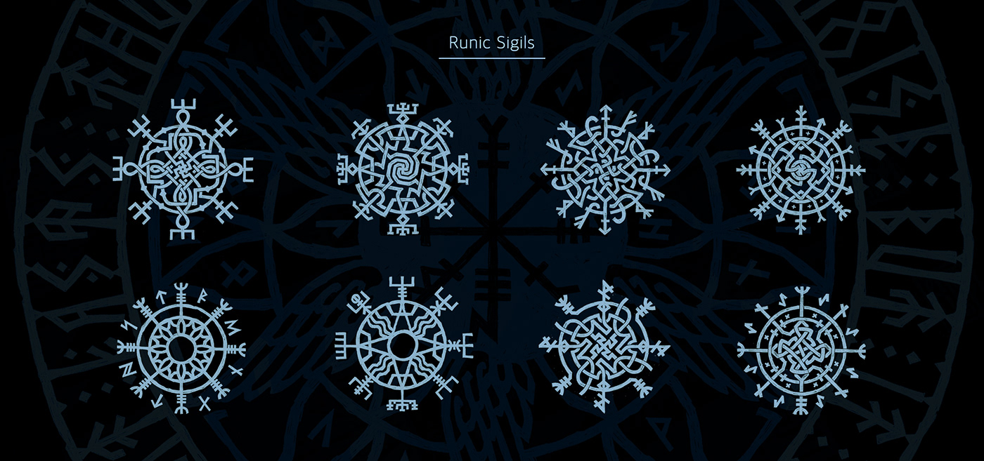


I had so much fun creating these small symbols. Some of them were created as possible runic tattoos. Even though I was sneakpeaking into the Galdrabók (an Icelandic manuscript containing a collection of 47 spells and sigils/staves), these were created just because of aesthetical purpose. On the last picture I've done geometric ornaments with non-existing runic symbols and "bindrunes", that were later compiled into font Bjorni. Check down below for more info.
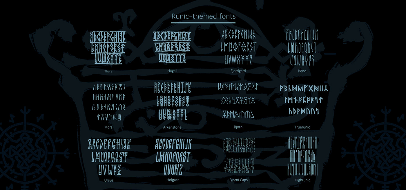
During the period of 2020-2022 I did a lot of sketching. From time to time I find some of my lettering works quite interesting, and then I try to compile a font from existing characters. However, most of these fonts were not released to public, but they were heavily used in my personal projects, as well as in certain client work. These fonts lack proper kerning and metrics, but they still represent good visual base and inspiration.
Fonts "Thurs" and "Hagal" are similar, but even in that similarity they contain a different after taste.
For the font "Fjordgard" I made an entire presentation, so I won't describe much here. "Beno" is a font with a nice potential, since it really reminds me of birch trees. "Mors" is a Cyrillic only font that's inspired both by Runes and Ustav calligraphy. "Arkenstone" is a font that's inspired by Dwarven aesthetics. "Bjorni" and "Bjorni Caps" is an abstract collection of non-existing runic symbols. Font "Bjorni" is a very fun font to use, since the caps characters represent an abstract bindrune, that's a very nice way to fill empty space in illustrations. It's more of a tool, than an actual text font. I've used this font during the development of Bjorn Hurry's art book, mostly in text ornaments. "Ursuz" is a Cyrillic font that's a bit robust and unpolished, but it's completely made out of elements from my personal work. "Holgast" is meant for public release. I've started working on this font in 2019 and it takes a long time to make this appealing for public release. First time this font publicly appeared in Fontself presentation during Adobe Max 2019 (page 49). "Truerunic" is based on actual Furhark runes. "Highrunic" is one of the first fonts I've ever made, I think it dates 2017, but I've started to use it in 2019. At first sight "Highrunic" is a rather primitive geometric font, but don't let this simplicity fool you.
Anyway, if you pay enough attention you may notice that these fonts were heavily used in different variety of works that are represented in my portfolio.


I really love how the original sketch turned into linocut and I've printed it in different techniques. On the pictures above you may notice that I've used graphite as ink, so the print turned out to be in a very bright grey color. At a certain point I've used classic black paint. In both variants, I've used handmade paper with dry flower inclusions, which made this print even more appealing and pleasant to eye.


In 2021 I've created different temporary tattoo sets, one of which was named "Runic set". It was completely made out from the works that were represented here. For this set I've created several new illustrations as well as a completely new "Palm" print.
Reference for these two palm illustrations were actually my hands. I've tried to somehow capture my "creative energy" using these "bindrunes" symbols. This might sound weird, which I understand completely, but this was a very interesting artistic approach, which gave me freedom. Still, the prints did not only became a nice addition, but in contrary they became the main element of this temporary tattoo collection.
Reference for these two palm illustrations were actually my hands. I've tried to somehow capture my "creative energy" using these "bindrunes" symbols. This might sound weird, which I understand completely, but this was a very interesting artistic approach, which gave me freedom. Still, the prints did not only became a nice addition, but in contrary they became the main element of this temporary tattoo collection.


This work is completely based on my font "Holgast". There's not much to be told about this work, but still I really like it due to really nice implementation of golden leaf. This print was done in a small amount of copies, all of which found their place in different homes.

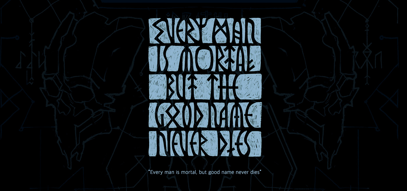
This composition is based on my font "Thurs", characters of which are being showcased in this presentation. This composition represents Odin's eye, that's watching Eternity.


Several compositions became part of my slowly evolving Forest project, that's been featured on Behance gallery earlier. On the very first photos you may notice a whole new technique with white paint. This is far more durable than golden leaf and more noticeable to random strangers that encounter this during their forest walk.


This work is very special to me, since from this sketch has started my active interest towards "runic" letters and symbols.
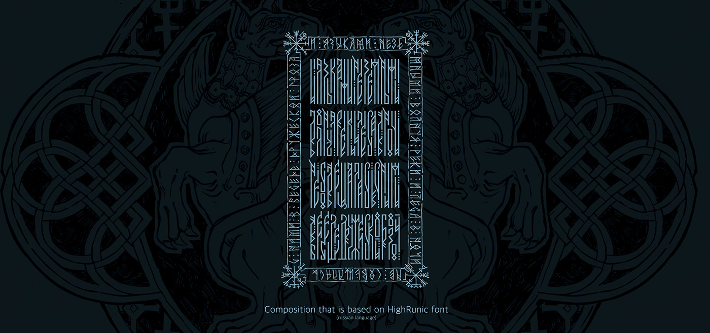
This is actually written Russian poetry drawn in Runic Vyaz style. Verse author is famous poet Fyodor Tyutchev.
Apart from making merchandise, the original print was done on handmade paper with rough edges via wet transfer. After drying, it was hand edited and I've added small details done in golden leaf Norris 23k.


These are smaller works, but I like them really much. They really deserve to be showcased here, since it's a completely fresh approach to runic letters and I'm planning to continue with their further development.


Lastly, I'm showcasing sketches that on first glance might be out of spoken narrative. Nonetheless, they still have the same runic touch, however they are written in a completely different technique. The result is exciting and unexpected, so they deserve exposure.
————
Anyway, thanks for reaching this part of presentation. I really hope my work is an inspiration and a nice source of information that may come handy in your work. If you have any questions or want to hire me for job, contact me via messages or email.
Until then, don't forget to appreciate and share this. Thanks in advance!
Viktor Pushkarev
Viktor Pushkarev
2020-2022


